Project Showcase: Leading the Creative on the 2025 Annual Report
Turning raw program data into an on-brand, easy-to-digest story of impact.
The Goal
Annual reports are mostly numbers, outcomes, and program data. Most donors skim them. The goal was to turn that information into a story people would want to read and could understand at a glance.
The Creative Direction
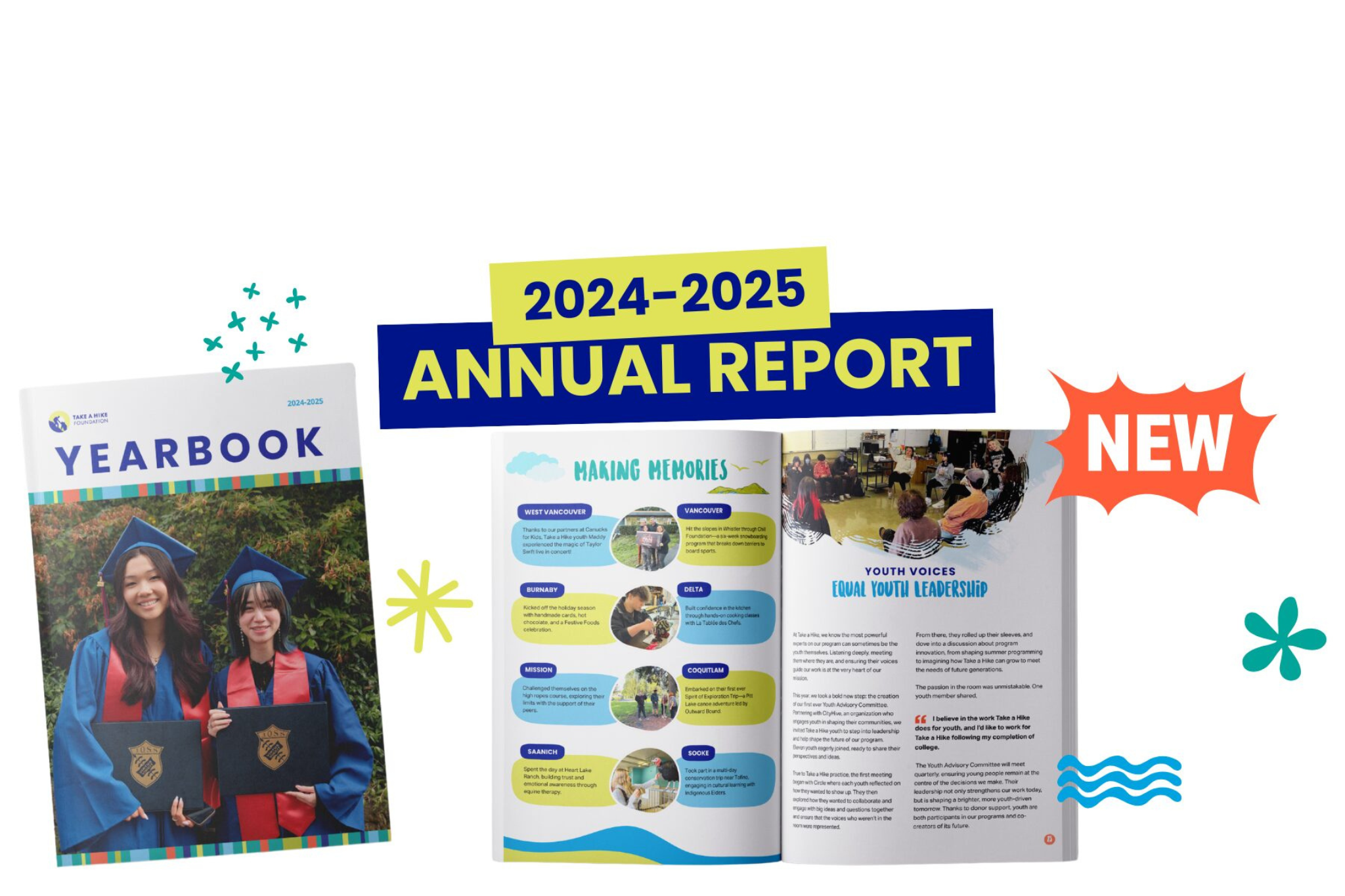
The team handed me the articles and data as Word documents with no design yet. I decided how the report would come together, including the concept, the structure, which outcomes to visualize, and how each story would be presented, all within the organization’s brand guidelines. I worked edits from the team into the design while keeping the overall vision intact.
The Design
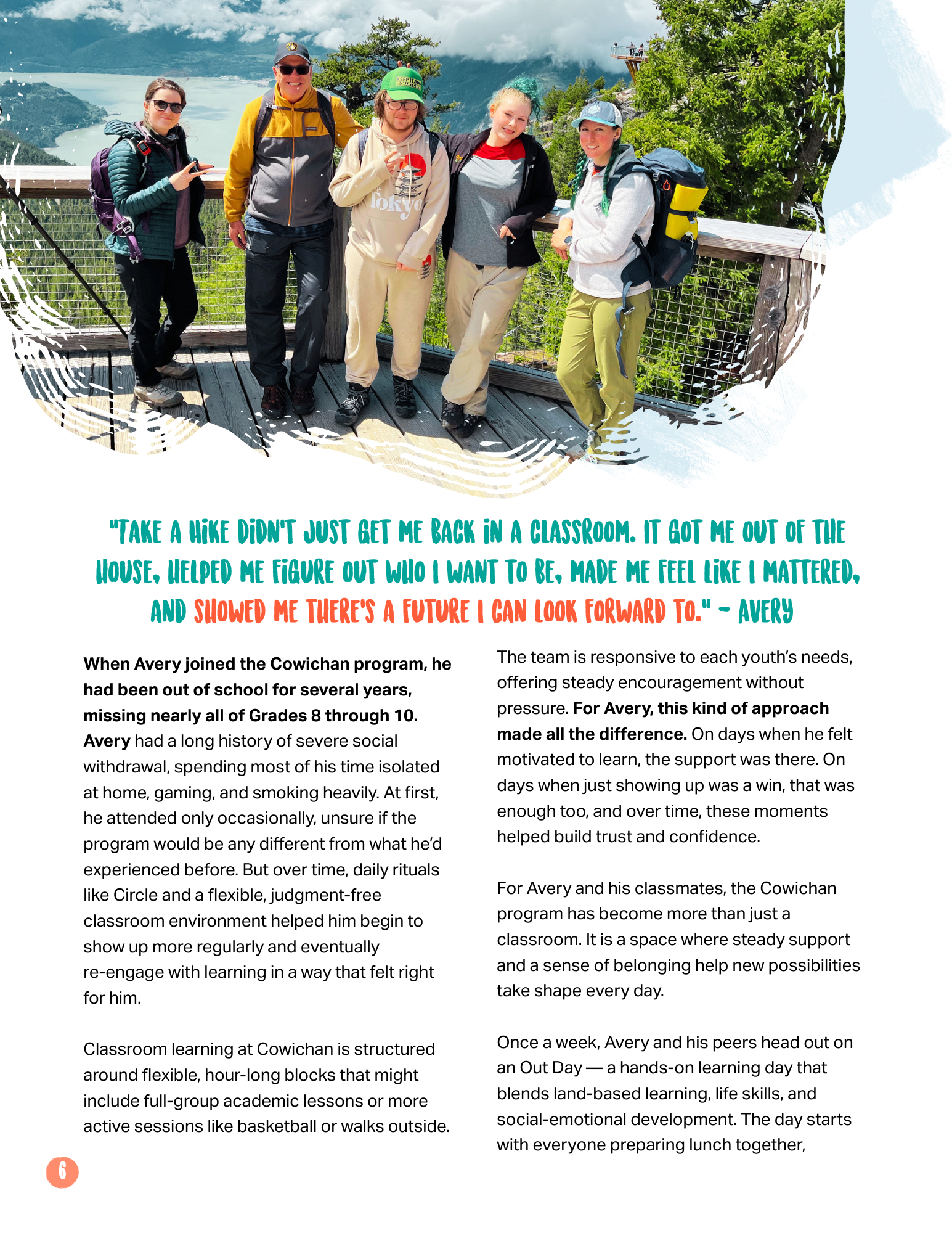
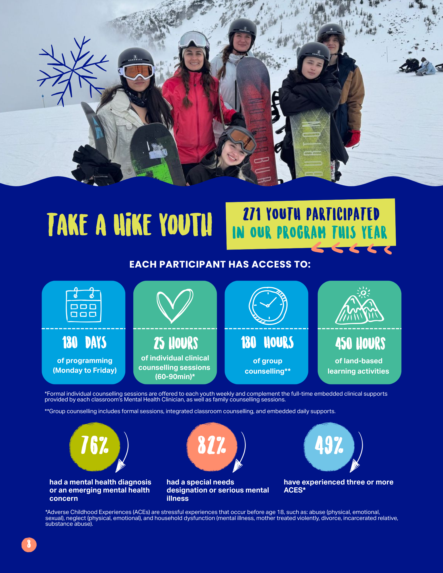
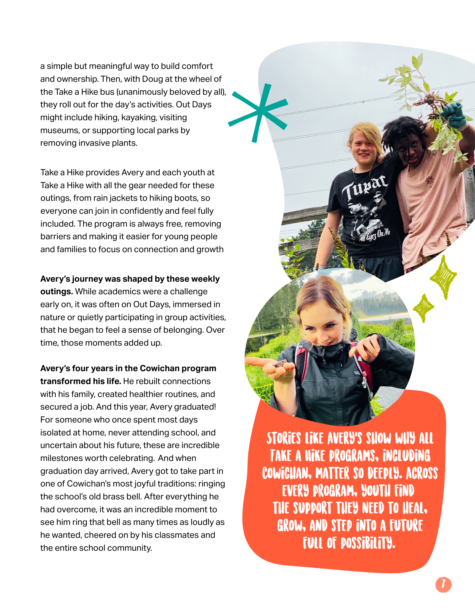
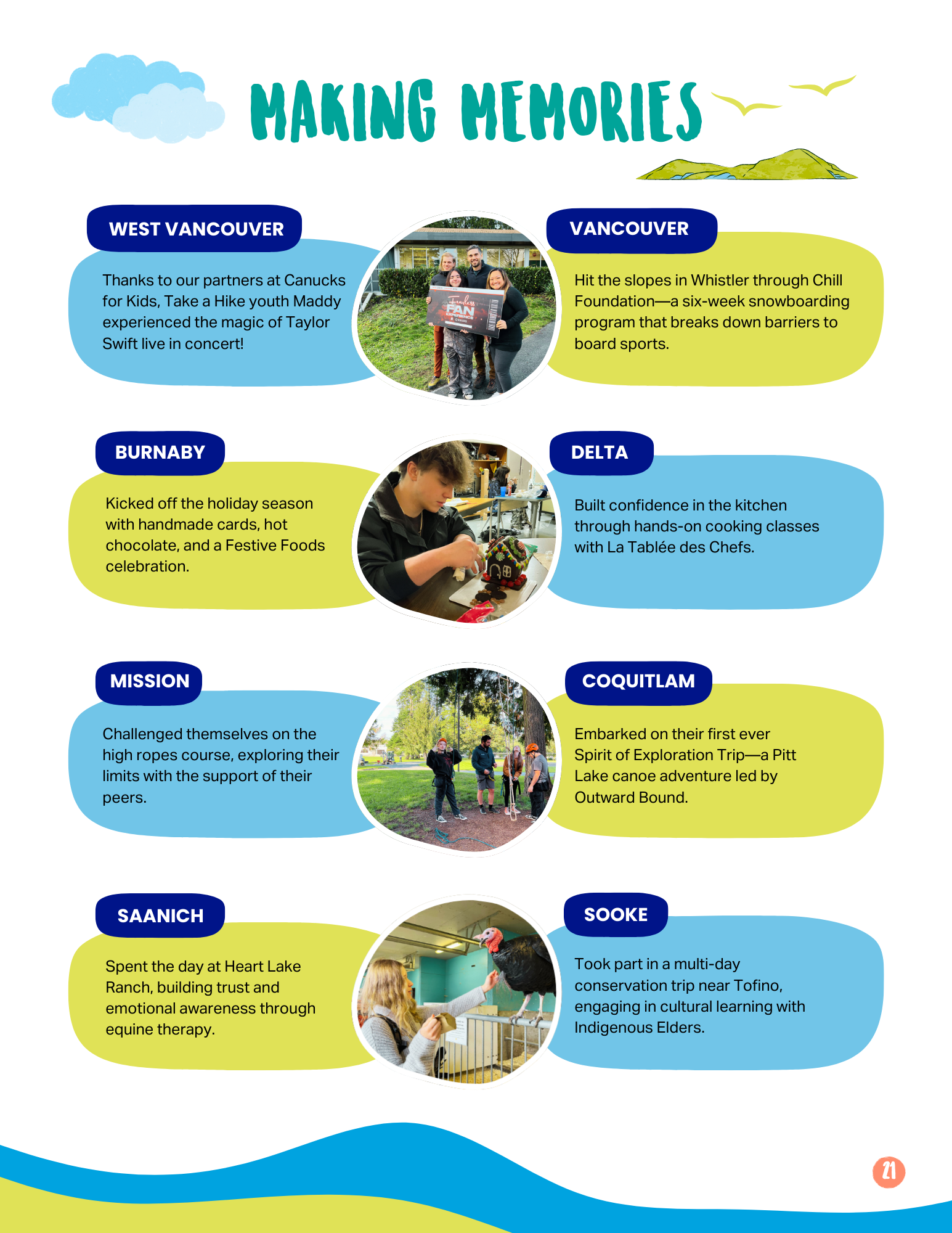
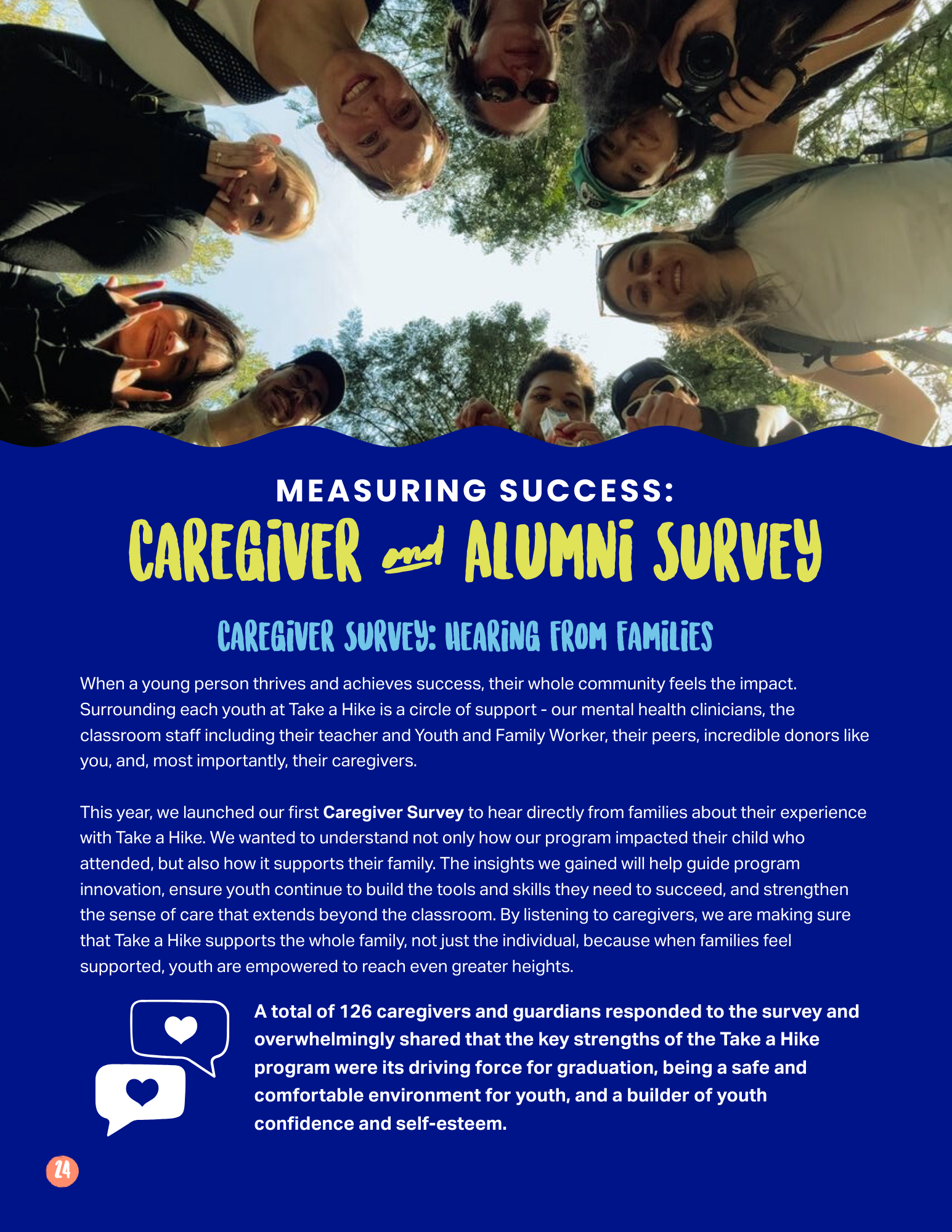
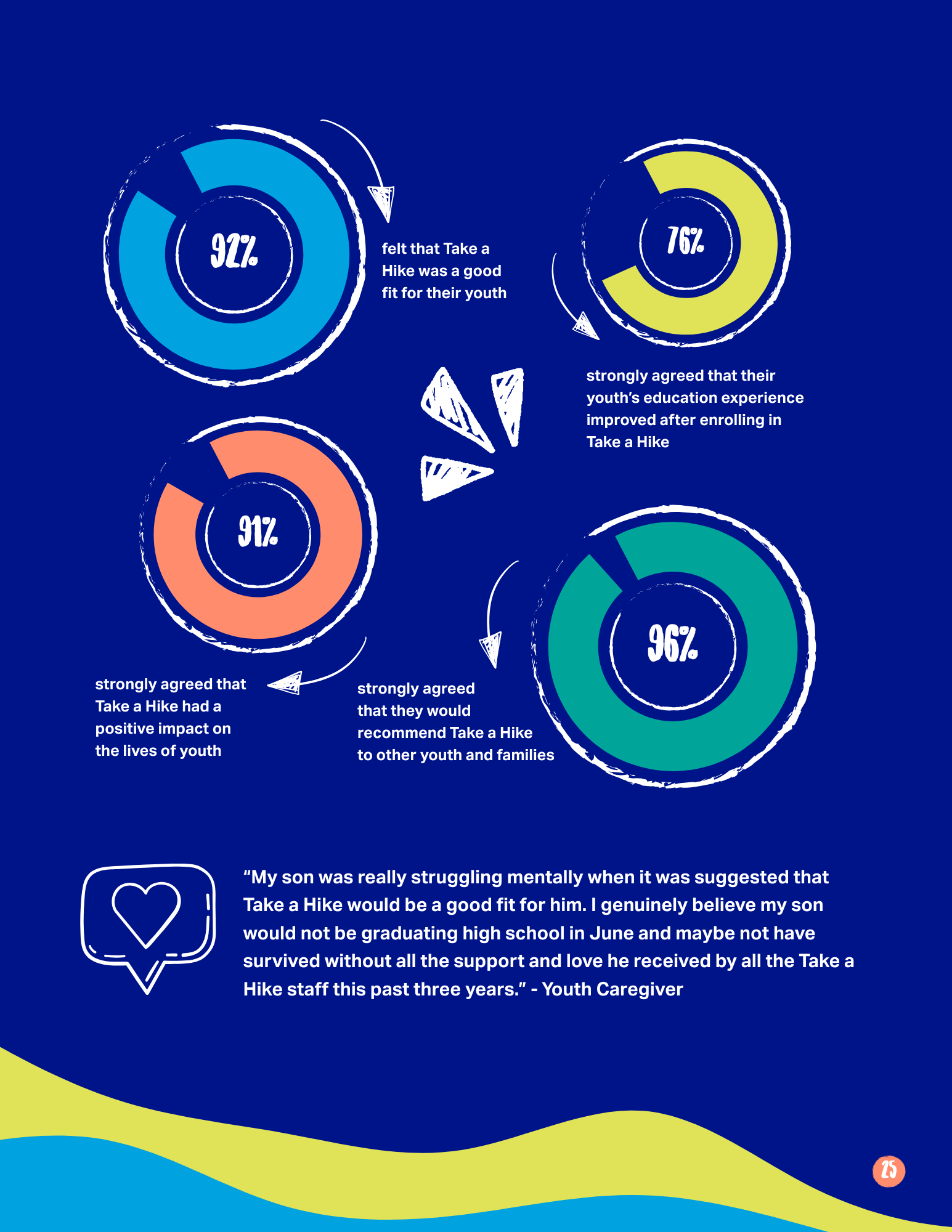
Every design choice served one goal, keeping dense data easy to read without stepping outside the brand. Clinical outcomes became simple infographics in the brand palette. Numbers sat next to the youth stories behind them, so every figure had context. Generous white space and soft, playful shapes kept heavy pages light, and colour rhythm and photo placement paced each spread so readers moved from story to outcome without getting lost.
Print Production
I took the report from screen to press. I set up print specs, colour profiles, and bleed and trim, prepared print-ready files, and ran quality checks across every spread so the printed piece matched the design exactly.
The Results
The finished report gave donors something they could be proud of. It showed what their support made possible, with every outcome tied to a real story and every number easy to read. Clear, on-brand, and built to be shared in print and online, it gave the organization a stewardship piece that builds trust and keeps donors coming back.